<?xml version="1.0" encoding="utf-8"?><feed xmlns="http://www.w3.org/2005/Atom" ><generator uri="https://jekyllrb.com/" version="3.10.0">Jekyll</generator><link href="https://www.aaron-chafetz.com/feed.xml" rel="self" type="application/atom+xml" /><link href="https://www.aaron-chafetz.com/" rel="alternate" type="text/html" /><updated>2026-07-28T20:20:52-04:00</updated><id>https://www.aaron-chafetz.com/feed.xml</id><title type="html">Aaron Chafetz</title><subtitle>Aaron Chafetz&apos;s personal website</subtitle><author><name>AARON CHAFETZ</name><email>achafetz@gmail.com</email></author><entry><title type="html">Simple Machines - Improving Workflows with APIs</title><link href="https://www.aaron-chafetz.com/presentations/posit-conf-simple-machines/" rel="alternate" type="text/html" title="Simple Machines - Improving Workflows with APIs" /><published>2024-08-14T00:00:00-04:00</published><updated>2024-08-14T00:00:00-04:00</updated><id>https://www.aaron-chafetz.com/presentations/posit-conf-simple-machines</id><content type="html" xml:base="https://www.aaron-chafetz.com/presentations/posit-conf-simple-machines/"><![CDATA[<p>Presentation at Posit Conf 2024 in Seattle, Washington</p>

<p>author: Karishma Srikanth, Aaron Chafetz</p>

<p>Efficient and scalable analytics workflows are critical for an adaptive and data-driven organization. How can we scale systems to support an office charged with implementing USAID’s $6 billion HIV/AIDS program? Our team leveraged R and global health APIs to build more efficient workflows through automation by developing custom R packages to access health program data. Our investment in creating an automated data infrastructure with flexible, open-source tools like R enabled us to build reproducible workflows for analysts in over 50 partner countries. We would like to share our experience in a federal agency integrating APIs with R to develop scalable data pipelines, as inspiration for organizations facing similar resource &amp; data challenges.</p>

<p>Presentation</p>

<iframe src="https://docs.google.com/presentation/d/1Al_vwqFaik86bDI9L1gpN2Q5yo6uJ6yMyuKUkd0jO4Y/embed?start=false&amp;loop=false&amp;delayms=3000&amp;slide=id.g2f1160efeaf_0_208" frameborder="0" width="480" height="299" allowfullscreen="true" mozallowfullscreen="true" webkitallowfullscreen="true"></iframe>]]></content><author><name>AARON CHAFETZ</name><email>achafetz@gmail.com</email></author><category term="presentations" /><category term="api" /><summary type="html"><![CDATA[Presentation at Posit Conf 2024 in Seattle, Washington]]></summary></entry><entry><title type="html">USAID Global Data Skills Workshop</title><link href="https://www.aaron-chafetz.com/presentations/bkk-gdsw/" rel="alternate" type="text/html" title="USAID Global Data Skills Workshop" /><published>2023-08-28T00:00:00-04:00</published><updated>2023-08-28T00:00:00-04:00</updated><id>https://www.aaron-chafetz.com/presentations/bkk-gdsw</id><content type="html" xml:base="https://www.aaron-chafetz.com/presentations/bkk-gdsw/"><![CDATA[<h2 id="overview">Overview</h2>
<p>From August 28-September 1, 2023, our division put on the USAID Global Data Skills Workshop in Bangkok, Thailand. For two and a half days, participants broke out into three different tracks by software preference (Excel, Tableau, R).</p>

<p>Goals - Understand how to optimize data lifecycles and workflows, build data skills in data visualization and statistical softwares and facilitate the sharing of critical data insights and solutions by Mission-based colleagues.</p>

<p>Objectives - Learn how to execute related and scalable functions in one of 3 tracks focused on Excel, Tableau or R/RStudio and principles on the following topics:</p>

<ol>
  <li>Data collection, pipelines, processing, and management; examples include working with imperfect data by learning how to profile and clean your data, and transforming a raw dataset into tidy data;</li>
  <li>Data Visualization/Summaries, such as understanding the basic concepts of a plot and how to select the right visualization for a given analysis, learning how to layer information from multi-dimensional data to build upon the plot/s, and applying the OHA Style Guide to develop impactful visualizations;</li>
  <li>Data Storytelling for data-driven, purposeful deliverables that translate into action.</li>
</ol>

<p>The below materials were used for the R tracks. All material have a <a href="https://creativecommons.org/licenses/by-nc/4.0/">CC-BY-NC license</a>,</p>

<blockquote>
  <p>…[enabling] reusers to distribute, remix, adapt, and build upon the material in any medium or format for noncommercial purposes only, and only so long as attribution is given to the creator. CC BY-NC includes the following elements:</p>

  <ul>
    <li>BY: credit must be given to the creator.</li>
    <li>NC: Only noncommercial uses of the work are permitted.</li>
  </ul>
</blockquote>

<p>The contents of the R training presentations were created specifically for the 2023 USAID Global Data Skills Workshop. If you plan on using and/or adapting any of the content from this session, please do the following:</p>

<ul>
  <li>contact the content creators, Aaron Chafetz (achafetz@usaid.gov) and Tim Essam (tessam@usaid.gov) as well as the OHA/SIEI Capacity Building group (gh.oha.siei.capacitybuilding@usaid.gov) for tracking purposes;</li>
  <li>ensure you have an attributions slide that states, “Content adapted from: Chafetz, A and T Essam. (2023 August). USAID Global Data Skills Workshop.”; and</li>
  <li>provide a link to this page for the original source material</li>
</ul>

<h2 id="material">Material</h2>
<p>(internal)</p>

<h3 id="working-with-data-in-r">Working with Data in R</h3>

<h3 id="data-visualizaton-fundamentals">Data Visualizaton Fundamentals</h3>

<h3 id="data-visualization-in-r">Data Visualization in R</h3>

<h3 id="pulling-it-all-together">Pulling It All Together</h3>]]></content><author><name>Aaron Chafetz, Tim Essam</name></author><category term="presentations" /><category term="r" /><category term="visualization" /><summary type="html"><![CDATA[Overview From August 28-September 1, 2023, our division put on the USAID Global Data Skills Workshop in Bangkok, Thailand. For two and a half days, participants broke out into three different tracks by software preference (Excel, Tableau, R).]]></summary></entry><entry><title type="html">Installing R, RStudio, RTools</title><link href="https://www.aaron-chafetz.com/manual/r_setup/" rel="alternate" type="text/html" title="Installing R, RStudio, RTools" /><published>2023-08-01T00:00:00-04:00</published><updated>2023-08-01T00:00:00-04:00</updated><id>https://www.aaron-chafetz.com/manual/r_setup</id><content type="html" xml:base="https://www.aaron-chafetz.com/manual/r_setup/"><![CDATA[<h4 id="installing-r-and-rstudio">Installing R and RStudio</h4>
<p>Working from your USAID laptop, Government Furnished Equipment (GFE), you can install R and RStudio without having to submit a ticket to the M/CIO Help Desk. R is the open-source statistics package that we use for our work and is the engine that powers RStudio Desktop, the user interface or integrated development environment (IDE). RStudio Desktop or another IDE such as Visual Studio Code is not required to use R, but will vastly improve your experience.</p>

<p>To install both R and RStudio Desktop on your GFE, go to Software Center on your computer (Start &gt; Microsoft Endpoint manager &gt; Software Center) Once there, you can select the Application called “R for Windows” and click “Install”. After that completes, you can then select “RStudio Desktop” and then “Install”. If you run into any issues, first try restarting your machine and if that fails, you can contact <a href="CIO-HELPDESK@usaid.gov">M/CIO Help Desk</a>.</p>

<p><img src="/assets/img/reference/software-center_r.png" alt="Software Center window with R and RStudio highlighted" /></p>

<p>If working on a personal machine, you can install R from <a href="https://cran.r-project.org/">CRAN</a>. Select “Download R for Windows” and then “base” and follow the instructions for installing that pop up when you launch the .exe file from your downloads. RStudio Desktop can be installed <a href="https://posit.co/download/rstudio-desktop/">Posit’s website</a> by selecting “Download RStudio Desktop for Windows” and then following the setup instructions.</p>

<h4 id="installing-rtools">Installing Rtools</h4>
<p>If you are working on a GFE, you will need to submit a ticket to <a href="CIO-HELPDESK@usaid.gov">M/CIO Help Desk</a> to install Rtools on your machine. If you are installing from your personal machine, you will need to <a href="https://cran.r-project.org/bin/windows/Rtools/">download</a> and install the version of Rtools based on the R version you are using. You can determine what version of R you are using by opening up a new instance of R or RStudio and the version will be the very first thing that appears in your console.</p>

<h4 id="rstudio-global-options">RStudio Global Options</h4>
<p>It’s best practice to start with a clean session each time you load up RStudio, so you will want to adjust some default options in your IDE. To access these, in the menu bar at the top, navigate to Tools &gt; Global Options. Here are the places you will want to make changes to the default options before you hit “Apply”:</p>

<ul>
  <li>Uncheck “Result most recent opened project at startup”</li>
  <li>Uncheck “Restore .RData into Workspace at startup”</li>
  <li>Change dropdown to “Never” for “Save workspace to .RData on exit”</li>
  <li>Uncheck “Always save history (even when not saving .RData)</li>
</ul>

<p><img src="/assets/img/reference/global-options.png" alt="RStudio Global Options menu with the items above changed" /></p>

<h4 id="storing-snippets">Storing Snippets</h4>
<p>Rstudio code snippets are predefined code shortcuts that can be used to quickly insert commonly used code blocks. The use of snippets can improve coding efficiency, reduce the time spent copying and pasting code from other scripts, and improve the readability of your code by providing a standardized format for your analytical scripts.</p>

<p>To create your own snippets in Rstudio, go to “Tools &gt; Global Options &gt; Code &gt; Edit Snippets. This will open a file where you can define your custom snippets using a simple syntax.</p>

<p><img src="/assets/img/reference/snippets_global-options.png" alt="RStudio Global Options highlighting where to access Snippets" /></p>

<p>Rstudio comes bundled with a set of built-in snippets that you may have already used without even realizing it. The snippets are not limited to just R, but to all of the different languages you can code in within the Rstudio IDE. In the example below, this snippet sets up the formatting of a script for you. To create a new snippet, follow the syntax in the window and click save. Your snippet is now available for use.</p>

<p><img src="/assets/img/reference/snippet-window.png" alt="RStudio Snippet window showing user created setup" /></p>

<p>For example, if we wanted to create snippet to insert a new object that represents the time right now, we could use the following snippet:</p>

<p><code class="language-plaintext highlighter-rouge">snippet time "insert time right now"
	Sys.time()
</code>
Close your snippet window by hitting save, and return to the console.</p>

<p>When we start typing we will then see the following appear.</p>

<p><img src="/assets/img/reference/snippet_insert.png" alt="RStudio Console window showing autofill of Snippet name" /></p>

<p>If we hit Tab, the <code class="language-plaintext highlighter-rouge">Sys.time()</code> function will be inserted in the console window. When we hit enter, Rstudio will report the current time. While this may not be that useful, you can imagine how useful this may be if you need to insert the date or a repeated chunk of code.</p>

<p>####Types of snippets
There are broadly four different types of snippets available for use or creation. 
Predefined snippets: RStudio comes with several built-in snippets for common programming tasks. These snippets cover a wide range of R code structures and functions, such as for loops, if statements, function definitions, and more.
Triggering snippets: Snippets are triggered by typing a specific keyword followed by pressing the “Tab” key. For example, if you type “for” and then press “Tab,” RStudio will automatically expand the snippet into a basic for loop structure.
Tab stops: Snippets may contain tab stops (usually denoted by the ${1}), indicated by numbers or placeholders. These allow you to quickly navigate through the different sections of the snippet by pressing the “Tab” key. For example, if you have a placeholder for a variable name, pressing “Tab” will move the cursor to that position, allowing you to enter the desired variable name.
Dynamic snippets: Snippets can be dynamic and include placeholders that are automatically filled with values based on the context. For example, the <code class="language-plaintext highlighter-rouge"># DATE:   `r Sys.Date()</code>` code chunk will insert today’s date into your script.</p>

<p>By using RStudio snippets, you can streamline your coding workflow, reduce repetitive typing, and improve overall productivity when working with R code. We highly encourage you to take advantage of snippets and share your discoveries with the team.</p>

<p><a href="https://gist.github.com/tessam30/fc775a2f917ea5d62de0f6724c4aeada">Link to SI Snippets</a></p>

<h4 id="additional-resources">Additional Resources</h4>
<ul>
  <li><a href="http://jtleek.com/modules/01_DataScientistToolbox/02_10_rtools/#1">Installing Rtools - Jeffrey Leek</a></li>
  <li><a href="https://usaid-oha-si.github.io/corps/rbbs/2022/01/28/rbbs-0-setup.html">RBBS - 0 Software and Account Setup: Setting up Rtools - Aaron Chafetz</a></li>
</ul>]]></content><author><name>Aaron Chafetz</name></author><category term="manual" /><category term="setup" /><category term="r" /><category term="rstudio" /><category term="rtools" /><category term="ide" /><summary type="html"><![CDATA[This document provide instructions on how to install Source Sans Pro Typeface on your personal computer]]></summary></entry><entry><title type="html">Installing Source Sans Pro Typeface</title><link href="https://www.aaron-chafetz.com/manual/typeface_setup/" rel="alternate" type="text/html" title="Installing Source Sans Pro Typeface" /><published>2023-08-01T00:00:00-04:00</published><updated>2023-08-01T00:00:00-04:00</updated><id>https://www.aaron-chafetz.com/manual/typeface_setup</id><content type="html" xml:base="https://www.aaron-chafetz.com/manual/typeface_setup/"><![CDATA[<h2 id="source-sans-pro-typeface">Source Sans Pro Typeface</h2>

<h4 id="installing-source-sans-pro">Installing Source Sans Pro</h4>

<p>To create standard visualizations across our SI team, we rely on one of USAID’s alternate fonts, <a href="https://fonts.google.com/specimen/Source+Sans+Pro">Sans Source Pro</a>. This typeface is not only not native to R, nor is it a standard to Windows, but is an open source typeface available from Google Fonts.</p>

<p><img src="/assets/img/reference/usaid-style_font.png" alt="Snapshot from USAID's Graphic Standards and Partner Co-Branding Guide showing the web typeface as Source Sans Pro Light" /></p>

<p><img src="/assets/img/reference/typeface_setup-usaid-style_font.png" alt="Source Sans Pro Font" /></p>

<p>To install the font on your GFE, you can find it in Software Center (Start &gt; Microsoft Endpoint manager &gt; Software Center). Once there, you can select the Application called “Source Sans Pro” and click “Install”.</p>

<p><img src="/assets/img/reference/typeface_setup-software-center_font.png" alt="Software Center window with Source Sans Pro highlighted" /></p>

<p>To install it on your computer, navigate to the typeface on <a href="https://fonts.google.com/specimen/Source+Sans+Pro">Google Fonts</a> and click the “Download family”. After the folder finishes downloading, unzip it.</p>

<h4 id="accessing-fonts-in-r">Accessing Fonts in R</h4>

<p>To use non-native fonts in R, you must run a program called <code class="language-plaintext highlighter-rouge">extrafonts</code>. You will need to run the following code below to install all the fonts on your computer (if desired) and the one you just downloaded/added. You will only need to import fonts only once on your machine. However, to use these fonts with any plotting in R, you will need to load the <code class="language-plaintext highlighter-rouge">extrafont</code> as with any other package.</p>

<div class="language-plaintext highlighter-rouge"><div class="highlight"><pre class="highlight"><code>#load library (install if these are not already installed)
library(extrafont)  #install.packages("extrafont")
library(remotes)  #install.packages("remotes")

#downgrade a package dependency for extrafont
#https://stackoverflow.com/questions/61204259/how-can-i-resolve-the-no-font-name-issue-when-importing-fonts-into-r-using-ext/68642855#68642855
install_version("Rttf2pt1", version = "1.3.8")

#import all Windows fonts
  font_import()
  
#restart your R session - CTRL + SHIFT + F10

#check that your fonts are now accessible in R
library(extrafont)
fonts()
</code></pre></div></div>

<p><img src="/assets/img/reference/typeface_setup-typeface_installed.png" alt="Output in R Console showing Source Sans Pro family installed" /></p>

<h4 id="additional-resources">Additional Resources</h4>

<ul>
  <li><a href="https://www.usaid.gov/branding/gsm">USAID Graphic Standards Manual</a></li>
  <li><a href="https://fonts.google.com/specimen/Source+Sans+Pro">Google Fonts: Sans Source Pro</a></li>
  <li><a href="https://stackoverflow.com/questions/61204259/how-can-i-resolve-the-no-font-name-issue-when-importing-fonts-into-r-using-ext/68642855#68642855">Stack Overflow: Resolve the “No Font Name Issue”</a></li>
  <li><a href="https://usaid-oha-si.github.io/glitr/">glitr package</a></li>
</ul>]]></content><author><name>Aaron Chafetz</name></author><category term="manual" /><category term="setup" /><category term="typeface" /><summary type="html"><![CDATA[This document provide instructions on how to install Source Sans Pro Typeface on your personal computer]]></summary></entry><entry><title type="html">Creating a reproducible example (reprex)</title><link href="https://www.aaron-chafetz.com/corps/creating-a-reprex/" rel="alternate" type="text/html" title="Creating a reproducible example (reprex)" /><published>2023-03-22T00:00:00-04:00</published><updated>2023-03-22T00:00:00-04:00</updated><id>https://www.aaron-chafetz.com/corps/creating-a-reprex</id><content type="html" xml:base="https://www.aaron-chafetz.com/corps/creating-a-reprex/"><![CDATA[<p>coRps Session on creating a reproducible example (reprex)</p>

<h2 id="overview">Overview</h2>

<p>Our goal today’s session is to explore and develop reproducible examples as a better way to ask for help when you run into a problem with R.</p>

<h3 id="recording">Recording</h3>
<p>USAID staff can use <a href="https://drive.google.com/file/d/1FWu09-Jb7IXC4j_qdVsoKuR4PsLPxObq/view?usp=sharing">this link</a> to access today’s recording (not available to external users).</p>

<h3 id="material">Material</h3>

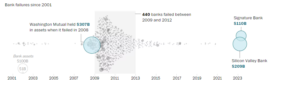
<iframe src="https://docs.google.com/presentation/d/e/2PACX-1vTmkiQE65oEOc-ihyoM3iFBYZu6XukaBfFI2UcrB9SQc4M4RPBYn6rXExTkQPI1-m89zTuo0taFntrS/embed?start=false&amp;loop=false&amp;delayms=3000" frameborder="0" width="960" height="569" allowfullscreen="true" mozallowfullscreen="true" webkitallowfullscreen="true"></iframe>]]></content><author><name>Aaron Chafetz</name></author><category term="corps" /><category term="munging" /><category term="wrangling" /><summary type="html"><![CDATA[coRps Session on creating a reproducible example (reprex)]]></summary></entry><entry><title type="html">Monday Data Viz - Moving Beyond Bars with Beeswarms</title><link href="https://www.aaron-chafetz.com/data%20viz/mdv-beeswarm/" rel="alternate" type="text/html" title="Monday Data Viz - Moving Beyond Bars with Beeswarms" /><published>2023-03-20T00:00:00-04:00</published><updated>2023-03-20T00:00:00-04:00</updated><id>https://www.aaron-chafetz.com/data%20viz/mdv-beeswarm</id><content type="html" xml:base="https://www.aaron-chafetz.com/data%20viz/mdv-beeswarm/"><![CDATA[<p>For those of you following US news at home, the Silicon Valley Bank (SVB) failure the other week has kept news organizations busy and investors worried. The SVB, heavily utilized by the tech sector to invest in and back start ups, didn’t have enough money on hand as clients withdrew funds (causing worry and more clients to pull their funds) resulting in the bank failing. While not in the top tier of the largest US banks, they still commanded a sizable share of assets in the market worth about over $200 billion. And their failure “is the second-largest failure of a federally insured bank, behind only Washington Mutual, which crashed at the start of the Great Recession in 2008.”</p>

<p>Amongst the plethora of articles the Washington Post published on the topic last week, there was one in particular that caught my eye. <a href="https://www.washingtonpost.com/business/2023/03/13/bank-failure-size-svb-signature/">Luis Melgar and Hamza Shaban wrote a very short article</a>, but included a couple of pretty fantabulous graphics. I want to focus on the one included below.</p>

<p><img src="/assets/images/posts/20230320_melgar-shaban_beeswarm.png" alt="beeswarm plot of US bank failures in the last 22 years" /></p>

<p>In their plot, Melgar and Shaban show how many banks have failed since 2001, as depicted by different sized points based on the size of their assets. This beeswarm plot is essentially a scatter plot that has one “real” axis. In this case, we have the date on the x-axis that is “real”. If we plotted these along a single x-axis, we wouldn’t be able to see how many banks failed because they could be overlapping points. To solve this problem, a beeswarm plot uses an artificial y-axis to distribute the points so they are not all on top of one another. All these points fanned out like this give the impression of a beeswarm, hence the name.</p>

<p>We can see that a lot of banks failed during the Great Recession, and Melgar and Shaban even annotated the plot to give you additional context that 400 banks failed during this period. The authors also used an encoding of size to show the magnitude. Washington Mutual in 2008 is the largest failure (and circle) followed by the recent failures of SVB and Signature Bank last week. These three banks are encoded with color as well to make them stand out against all the other bank failures.</p>

<p>This plot certainly could have been a bar chart, showing either how many banks failed in a given year or the value in assets, but this gives us a much richer understanding of what is going on. The same is also true with our PEPFAR data. We typically aggregate our site level data up higher orders of magnitude (e.g. national/sub-national units, agency, partner), which can be useful, but we lose out on a lot of great detail and stories by masking this more granular data. I encourage you all to go beyond reporting out aggregated data and to explore the stories contained within your finer level of detail data.</p>

<p>Happy plotting!</p>]]></content><author><name>Aaron Chafetz</name></author><category term="data viz" /><category term="vizualisation" /><category term="Monday data viz" /><summary type="html"><![CDATA[For those of you following US news at home, the Silicon Valley Bank (SVB) failure the other week has kept news organizations busy and investors worried. The SVB, heavily utilized by the tech sector to invest in and back start ups, didn’t have enough money on hand as clients withdrew funds (causing worry and more clients to pull their funds) resulting in the bank failing. While not in the top tier of the largest US banks, they still commanded a sizable share of assets in the market worth about over $200 billion. And their failure “is the second-largest failure of a federally insured bank, behind only Washington Mutual, which crashed at the start of the Great Recession in 2008.”]]></summary></entry><entry><title type="html">Monday Data Viz - Icons + Data Viz</title><link href="https://www.aaron-chafetz.com/data%20viz/mdv-icons/" rel="alternate" type="text/html" title="Monday Data Viz - Icons + Data Viz" /><published>2023-03-13T00:00:00-04:00</published><updated>2023-03-13T00:00:00-04:00</updated><id>https://www.aaron-chafetz.com/data%20viz/mdv-icons</id><content type="html" xml:base="https://www.aaron-chafetz.com/data%20viz/mdv-icons/"><![CDATA[<p>Over the last couple of months, I have been inundated with all sorts of packaging after the arrival of our little guy and the one below caught my eye.</p>

<p><img src="/assets/images/posts/20230313_hatch_icons.png" alt="icons from box" /></p>

<p>What stood out to me was the similarity of the icons used. These icons clearly come from the same “family”, which we can identify from the line weighting, the style, level of detail, stroke v fill, etc. All too often when we see icons used in the visualization space, they are pulled from Google or are combined with icons that just don’t quite fit the same style.</p>

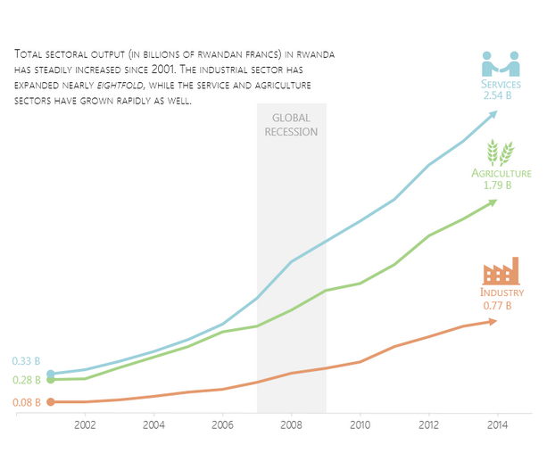
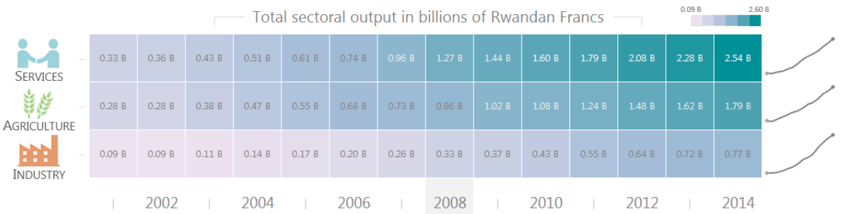
<p>Icons, when used appropriately, can make it easier for us to communicate concepts and reduce the amount of noise going on in a visual or dashboard. Yes, icons can be used as the visualization itself, an Isotype chart, but I’m thinking mainly about the little part of the visualization. In the two visuals below from a very old <a href="https://geocenter.github.io/StataTraining/part4/">Essam + Chafetz collaboration</a> (in our Stata and pre-OHA years) the icons add to what could otherwise be a pretty plain line chart and heat map, by helping draw the reader’s attention and making it easier for them to associate data with an icon rather than just text.</p>

<p><img src="/assets/images/posts/20230313_essam_line-icons.png" alt="line graph with icons at end" />
<img src="/assets/images/posts/20230313_essam_heatmap-icons.png" alt="heatmap with icons" /></p>

<p>This is also true in a dashboard. We want to use icons across the document that make it easier for the audience to navigate and interpret, while minimizing the amount of text and distraction. But we have to make sure those icons work well together and work well with the feel of what is a part of.</p>

<p>Next time you are designing a visualization or dashboard, think about how you can incorporate a family of icons to accentuate your work.</p>

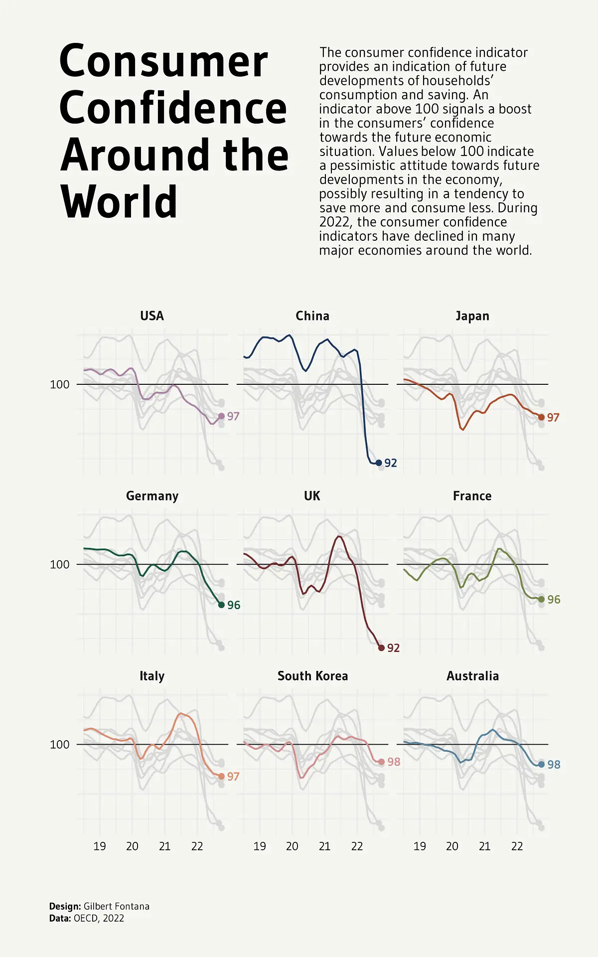
<p>Happy plotting!</p>]]></content><author><name>Aaron Chafetz</name></author><category term="data viz" /><category term="vizualisation" /><category term="Monday data viz" /><summary type="html"><![CDATA[Over the last couple of months, I have been inundated with all sorts of packaging after the arrival of our little guy and the one below caught my eye.]]></summary></entry><entry><title type="html">Monday Data Viz - Small Multiples and Group Context</title><link href="https://www.aaron-chafetz.com/data%20viz/mdv-small-multiples-group/" rel="alternate" type="text/html" title="Monday Data Viz - Small Multiples and Group Context" /><published>2023-03-06T00:00:00-05:00</published><updated>2023-03-06T00:00:00-05:00</updated><id>https://www.aaron-chafetz.com/data%20viz/mdv-small-multiples-group</id><content type="html" xml:base="https://www.aaron-chafetz.com/data%20viz/mdv-small-multiples-group/"><![CDATA[<p>I, like the next data visualizer, love small multiples graphs. And I was happy to see Yan Holtz (of <a href="https://www.data-to-viz.com/">From Data To Viz</a>) added a <a href="https://r-graph-gallery.com/web-line-chart-small-multiple-all-group-greyed-out.html">great small multiples plot</a> to his <a href="https://r-graph-gallery.com/index.html">R Graph Gallery site</a>. For this viz, Hotlz recreated a visualization <a href="https://www.visualcapitalist.com/cp/charting-the-global-decline-in-consumer-confidence/">originally produced by Gilbert Fontana in the Visual Capitalist</a> about the decline in consumer confidence.</p>

<p><img src="/assets/images/posts/20230306_fontana_consumer-confidence.png" alt="small multiples line graph showing declining consumer confidence across a number of countries" /></p>

<p>How cool is this? If you were to plot all the countries’ lines on one chart, you would have what is affectionately known as a spaghetti plot. But by breaking out the trends by country, you can quickly and more easily compare how each individual is doing. And to take this a step further than the normal small multiples you typically see, the plot also had the additional context piece of all the other countries faintly plotted in the background.</p>

<p>If you haven’t checked out Holtz’s R graphic gallery before, it is an amazing resource with <a href="https://r-graph-gallery.com/web-line-chart-small-multiple-all-group-greyed-out.html">how to build</a> all different sorts of plots (in R for this particular site) from the ground up. So you can not only be inspired by the different graph types, but also learn to recreate them with your own work.</p>

<p>When you are creating your next small multiples graph, I would highly encourage you to consider adding in additional contextual info by drawing in the other comparison points in a light color/high transparency in the background.</p>

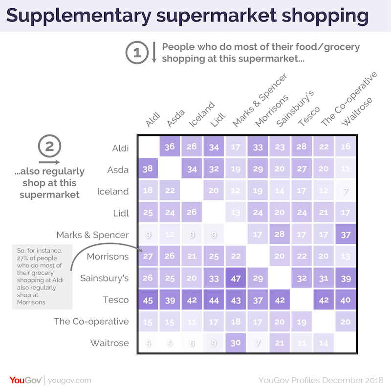
<p>Happy plotting!</p>]]></content><author><name>Aaron Chafetz</name></author><category term="data viz" /><category term="vizualisation" /><category term="Monday data viz" /><summary type="html"><![CDATA[I, like the next data visualizer, love small multiples graphs. And I was happy to see Yan Holtz (of From Data To Viz) added a great small multiples plot to his R Graph Gallery site. For this viz, Hotlz recreated a visualization originally produced by Gilbert Fontana in the Visual Capitalist about the decline in consumer confidence.]]></summary></entry><entry><title type="html">Monday Data Viz - Helper Annotation</title><link href="https://www.aaron-chafetz.com/data%20viz/mdv-helper-annotation/" rel="alternate" type="text/html" title="Monday Data Viz - Helper Annotation" /><published>2023-02-27T00:00:00-05:00</published><updated>2023-02-27T00:00:00-05:00</updated><id>https://www.aaron-chafetz.com/data%20viz/mdv-helper-annotation</id><content type="html" xml:base="https://www.aaron-chafetz.com/data%20viz/mdv-helper-annotation/"><![CDATA[<p>I came across a not-so-straight forward visualization the other day and it made me think of <a href="https://www.visualisingdata.com/2019/04/the-little-of-visualisation-design-part-63/">a piece</a> from Andy’s Kirk’s <a href="https://visualisingdata.com/2016/03/little-visualisation-design/">“the little of visualization design” series</a> from a long while back about making your work more accessible. In his post, Kirk highlighted a viz from <a href="https://yougov.co.uk/topics/consumer/articles-reports/2019/04/05/tesco-nations-primary-secondary-supermarket">YouGov</a> that provided additional annotations at the top and left to help the reader understanding the axes and plot. I think what is especially useful is the explanation text that is giving an example of interpreting a data point from the graphic (or “coaching” as Kirk refers to it as).</p>

<p><img src="/assets/images/posts/20230227_yougov_helper-annotation.png" alt="heatmap with annotation to help reader understand axes and cells" /></p>

<p>Adding his sort of guided annotation may not be necessary for every plot, but it’s useful to consider your audience and the complexity of the visualization from their standpoint. A presentation that either needs to stand on its own without you presenting or material being sent to leadership may be prime for including an additional level of annotated text.</p>

<p>Happy plotting!</p>]]></content><author><name>Aaron Chafetz</name></author><category term="data viz" /><category term="vizualisation" /><category term="Monday data viz" /><summary type="html"><![CDATA[I came across a not-so-straight forward visualization the other day and it made me think of a piece from Andy’s Kirk’s “the little of visualization design” series from a long while back about making your work more accessible. In his post, Kirk highlighted a viz from YouGov that provided additional annotations at the top and left to help the reader understanding the axes and plot. I think what is especially useful is the explanation text that is giving an example of interpreting a data point from the graphic (or “coaching” as Kirk refers to it as).]]></summary></entry><entry><title type="html">Monday Data Viz - Simple Yet Elegant</title><link href="https://www.aaron-chafetz.com/data%20viz/mdv-simple-yet-elegant/" rel="alternate" type="text/html" title="Monday Data Viz - Simple Yet Elegant" /><published>2023-02-06T00:00:00-05:00</published><updated>2023-02-06T00:00:00-05:00</updated><id>https://www.aaron-chafetz.com/data%20viz/mdv-simple-yet-elegant</id><content type="html" xml:base="https://www.aaron-chafetz.com/data%20viz/mdv-simple-yet-elegant/"><![CDATA[<p>I wanted to share a graphic I lifted from <a href="https://www.washingtonpost.com/newsletters/how-to-read-this-chart/">Philip Bump’s newsletter</a>. In it, he shows a <a href="https://twitter.com/JayCuda/status/1615921344054525954">simple yet elegant plot</a> from Jay Cuda, which depicts baseball stadium elevations. The outlier at the very tippy top is the Colorado Rockies’ Coors Field in Denver. So, it doesn’t take a super fancy graph to make a strong point (or to point out a very strong outlier).</p>

<p><img src="/assets/images/posts/20230206_cuda_mlb-elevation.pngg" alt="baseball stadiums elevations along a y axis" /></p>

<p>Happy plotting!</p>]]></content><author><name>Aaron Chafetz</name></author><category term="data viz" /><category term="vizualisation" /><category term="Monday data viz" /><summary type="html"><![CDATA[I wanted to share a graphic I lifted from Philip Bump’s newsletter. In it, he shows a simple yet elegant plot from Jay Cuda, which depicts baseball stadium elevations. The outlier at the very tippy top is the Colorado Rockies’ Coors Field in Denver. So, it doesn’t take a super fancy graph to make a strong point (or to point out a very strong outlier).]]></summary></entry></feed>